

People often use “UX” and “UI” as if they meant the same thing, but they describe different, complementary disciplines. Understanding UX vs UI design helps business owners hire the right skills, helps marketers brief projects clearly and helps teams build digital products people actually enjoy using. This guide explains the difference and sets out the core principles that make any interface easy to use.
Key takeaways
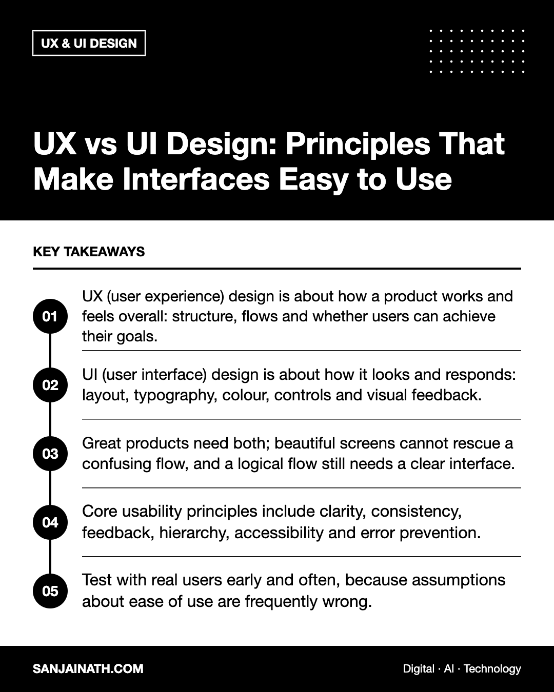
- UX (user experience) design is about how a product works and feels overall: structure, flows and whether users can achieve their goals.
- UI (user interface) design is about how it looks and responds: layout, typography, colour, controls and visual feedback.
- Great products need both; beautiful screens cannot rescue a confusing flow, and a logical flow still needs a clear interface.
- Core usability principles include clarity, consistency, feedback, hierarchy, accessibility and error prevention.
- Test with real users early and often, because assumptions about ease of use are frequently wrong.
UX vs UI design: the core difference
A helpful analogy is a house. UX design is the architecture: how many rooms there are, how they connect and whether the kitchen is near the dining room. UI design is the interior design: the finishes, lighting, door handles and colour scheme. Both shape how it feels to live there.
| Aspect | UX design | UI design |
|---|---|---|
| Main question | Does this solve the user’s problem easily? | Is this clear, attractive and consistent to use? |
| Focus | Research, structure, flows, information architecture | Visual design, components, typography, interaction states |
| Typical outputs | User research, personas, journey maps, sitemaps, wireframes, prototypes | High-fidelity mockups, design systems, style guides, icon sets |
| Measured by | Task success, time on task, conversion, satisfaction | Visual clarity, consistency, accessibility, brand alignment |
In smaller teams one person often covers both, frequently under the title “product designer”. In larger organisations the roles are more specialised, alongside UX researchers, content designers and interaction designers.
What UX designers do
Research
UX starts with understanding users through interviews, surveys, analytics and usability testing. The aim is to learn what people are trying to achieve, the context they are in and what gets in their way.
Information architecture
This is the organisation and labelling of content so people can find what they need. Card sorting and tree testing are common techniques for checking whether navigation labels make sense to users.
User flows and wireframes
UX designers map the steps a user takes to complete a task, such as booking an appointment, and then sketch simple, low-detail layouts called wireframes to test the structure before visual design begins.
Prototyping and testing
Clickable prototypes let teams test ideas with real users before any code is written, which is far cheaper than fixing problems after launch.
What UI designers do
Visual hierarchy and layout
UI designers use size, weight, colour, spacing and position to show users what matters most on each screen and where to look next.
Typography and colour
They choose readable typefaces, comfortable line lengths and colour palettes that reflect the brand while maintaining sufficient contrast.
Components and design systems
Buttons, forms, cards, menus and modals are designed as reusable components with defined states, such as default, hover, focus, disabled and error. A design system documents these so the product stays consistent as it grows.
Interaction and motion
Subtle animation and feedback, such as a button changing state when pressed, help users understand what is happening.
Principles that make interfaces easy to use
Whether you are commissioning a website, an app or an internal tool, these principles apply across UX and UI.
1. Clarity over cleverness
Use plain labels that describe what things do. “Download invoice” beats a creative but vague phrase. Avoid unexplained icons for important actions.
2. Consistency
The same action should look and behave the same way everywhere. Consistent patterns reduce learning time and mistakes. Follow familiar conventions, such as a logo that links to the homepage, unless you have a strong reason not to.
3. Clear visual hierarchy
Each screen should have one primary action that stands out. Secondary actions should be visibly less prominent.
4. Feedback and system status
Users should always know what is happening. Show loading indicators, confirm successful actions and explain what went wrong when an error occurs.
5. Error prevention and recovery
Prevent mistakes with sensible defaults, inline validation and confirmations for destructive actions. When errors do happen, write messages that explain the problem and how to fix it.
6. Recognition rather than recall
Make options visible rather than expecting users to remember them. Show recently used items, keep important navigation in view and use clear breadcrumbs on deep sites.
7. Accessibility for everyone
Accessible design benefits all users. Key practices include:
- Sufficient colour contrast for text and controls.
- Full keyboard navigation with visible focus states.
- Descriptive alternative text for meaningful images.
- Form fields with visible labels, not just placeholder text.
- Touch targets large enough to tap comfortably on mobile.
The Web Content Accessibility Guidelines (WCAG) provide a widely recognised standard to design against.
8. Design for real contexts
Consider slow connections, small screens, bright sunlight and one-handed use. For GCC audiences, bilingual interfaces also need proper right-to-left layouts for Arabic, which affects navigation order, icons that imply direction and text alignment, not just translated words.
How UX and UI work together in a project
- Discover: research users, business goals and constraints.
- Define: agree on the problems to solve and success measures.
- Structure: create information architecture, user flows and wireframes.
- Test structure: validate flows with low-fidelity prototypes.
- Design interface: apply visual design and components to create high-fidelity screens.
- Test again: run usability tests on the polished prototype.
- Hand over and support build: work with developers on specifications and edge cases.
- Measure and iterate: review analytics and feedback after launch.
Quick usability checklist for your website
- Can a new visitor tell what you offer within a few seconds?
- Is the main call to action obvious on every key page?
- Can users complete core tasks on a mobile phone without zooming?
- Do forms ask only for essential information?
- Are error messages specific and helpful?
- Is text readable with sufficient contrast?
- Does navigation use words your customers would use?
Frequently asked questions
Which comes first, UX or UI?
UX work usually comes first, because the structure and flows should be validated before investing in detailed visual design. In practice the two overlap and iterate together.
Do I need separate UX and UI designers?
Not necessarily. Many small and mid-sized projects are well served by a product designer skilled in both. Larger or complex products benefit from specialists.
How do I test usability on a small budget?
Ask a handful of people who match your audience to complete key tasks while thinking aloud. Even a few sessions typically reveal the biggest problems.
Is good UI just about looking attractive?
No. Good UI design communicates clearly, guides attention and supports accessibility. Visual appeal matters, but clarity matters more.
Final thoughts
The UX vs UI design debate is less about choosing one and more about understanding how they fit together. UX makes sure you build the right thing in the right structure; UI makes it clear, consistent and pleasant to use. Apply the principles above, test with real people and your interfaces will be easier to use, and more effective for your business.