

A landing page has one job: persuade a specific visitor to take a specific action. Yet many businesses send paid traffic to cluttered homepages or generic pages that try to do everything at once. Following proven landing page best practices — from message match to form design — can help turn more of your hard-won visitors into leads and customers. This article breaks down the anatomy of a high-converting page, section by section.
Key takeaways
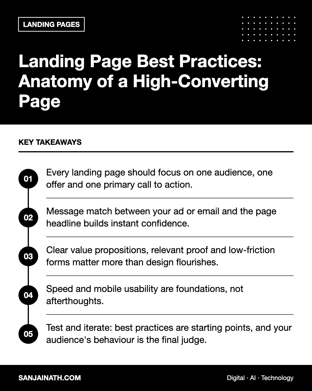
- Every landing page should focus on one audience, one offer and one primary call to action.
- Message match between your ad or email and the page headline builds instant confidence.
- Clear value propositions, relevant proof and low-friction forms matter more than design flourishes.
- Speed and mobile usability are foundations, not afterthoughts.
- Test and iterate: best practices are starting points, and your audience’s behaviour is the final judge.
What makes a landing page different
A landing page is a standalone page designed for a campaign or offer. Unlike a homepage, which serves many audiences and purposes, a landing page removes distractions so visitors can make one decision. Common types include:
- Lead generation pages that exchange a guide, consultation, quote or brochure for contact details.
- Click-through pages that warm visitors up before sending them to a checkout or sign-up flow.
- Product or offer pages built for a specific promotion.
- Event or webinar registration pages.
- Property launch pages that collect registrations of interest for a new development.
The anatomy of a high-converting landing page
While layouts vary, most effective pages contain the same building blocks in a logical order.
1. A headline that matches the promise
The headline is the first thing visitors read, and it should confirm they are in the right place. If your ad promises “Free SEO audit for e-commerce stores”, the headline should echo that promise rather than introduce a vague brand slogan. This principle, known as message match, reduces the uncertainty that causes people to bounce.
Support the headline with a subheading that explains the benefit in more detail, such as who it is for and what outcome they can expect.
2. A clear value proposition above the fold
Within a few seconds, visitors should understand what you offer, why it matters to them and what to do next. Above the fold — the portion visible without scrolling — typically includes the headline, subheading, a relevant visual and the primary call to action.
3. A relevant hero visual
Use an image or short video that shows the product in use, the outcome customers achieve or the people behind the service. Avoid generic stock photos that could belong to any company. For software, a clear product screenshot often outperforms abstract imagery.
4. Benefits before features
Explain what the customer gains, then support it with features. Short benefit-led sections with icons or subheadings work well:
- “Get qualified leads delivered to your CRM automatically” rather than “API integration”.
- “Move in within twelve months” rather than “Scheduled completion Q4”.
5. Social proof and credibility
People look for reassurance before acting. Include genuine proof such as:
- Real customer testimonials with names and roles, used with permission.
- Logos of clients or partners you are authorised to display.
- Ratings from recognised review platforms.
- Certifications, awards, regulatory registrations or industry memberships.
- Case study summaries with verifiable outcomes.
Place proof close to the points where visitors may hesitate — near the form or pricing, for example.
6. A focused call to action
Your primary call to action (CTA) should be visually prominent, clearly worded and repeated at logical points on longer pages. Use action-oriented, specific language: “Get my free audit” or “Book a viewing” tends to communicate more than “Submit”.
7. Objection handling
Anticipate the questions that stop people from converting. A short FAQ section, a note about data privacy, clear pricing or a guarantee can resolve doubts without requiring a sales call.
Form design: reducing friction
For lead generation pages, the form is where conversion happens. Apply these landing page best practices:
- Ask only for what you need now. Every extra field adds effort. Collect additional details later in the relationship.
- Use clear labels above fields rather than placeholder text that disappears when typing.
- Choose the right input types — email and phone keyboards on mobile, dropdowns for fixed options, and country code selectors for international numbers.
- Validate inline with helpful error messages instead of clearing the form after submission.
- Explain what happens next, such as “A consultant will call you within one working day”.
- Offer alternatives where appropriate, such as a WhatsApp or click-to-call button, which many audiences in the GCC prefer.
- Respect privacy: link to your privacy policy and capture marketing consent clearly and separately.
Design principles that support conversion
- Visual hierarchy: size, contrast and spacing should guide the eye from headline to benefits to CTA.
- Minimal navigation: remove or reduce the main site menu to limit exits.
- Whitespace: generous spacing improves readability and focus.
- Consistent branding: the page should feel continuous with the ad or email that led there.
- Directional cues: imagery and layout can point attention towards the form or button.
- Accessibility: sufficient contrast, readable font sizes, descriptive button text and keyboard-friendly forms.
Speed and mobile experience
Most campaign traffic arrives on mobile devices, often over variable connections. A slow or awkward page wastes your media budget.
- Compress and properly size images, and use modern formats.
- Limit third-party scripts to those you genuinely need.
- Keep the CTA visible or easy to reach on small screens, for example with a sticky button.
- Test on real devices, not just desktop browser previews.
- Monitor Core Web Vitals for your key landing pages.
A landing page best practices checklist
| Element | Question to ask |
|---|---|
| Headline | Does it match the ad and state a clear benefit? |
| Value proposition | Can a visitor explain the offer after five seconds? |
| Visual | Does it show the product, outcome or people? |
| Proof | Is there genuine, relevant evidence near the CTA? |
| CTA | Is there one clear, specific primary action? |
| Form | Are we asking only for essential information? |
| Speed | Does the page load quickly on mobile? |
| Tracking | Are conversions and form starts measured accurately? |
Testing and continuous improvement
Best practices provide a strong starting point, but every audience is different. Use analytics, heatmaps, session recordings and user feedback to identify friction, then test changes such as headlines, CTA wording, form length, proof placement and page length. With enough traffic, A/B testing can confirm which version performs better; with limited traffic, focus on larger, research-backed changes.
Frequently asked questions
How long should a landing page be?
It depends on the complexity and cost of the offer. Simple, low-commitment offers can use short pages, while high-value decisions often need longer pages that address more questions.
Should a landing page have navigation?
Generally, removing or minimising navigation helps keep visitors focused on the main action, though a link to key trust information can be useful.
How many CTAs should a landing page have?
One primary action, which may be repeated several times. Secondary options, such as a WhatsApp chat, should support rather than compete with it.
What tools can I use to build landing pages?
Options include dedicated landing page builders, CMS page builders such as those for WordPress, and the landing page features within marketing platforms like HubSpot.
Final thoughts
High-converting landing pages are built on clarity and focus. Match the visitor’s expectation, communicate value quickly, prove your credibility, make the action easy and keep the page fast. Treat these landing page best practices as a foundation, then let testing reveal what resonates most with your audience.